


My favourite feature of Xcode 6 so far is the new size classes concept in Interface Builder. Size classes are Apple's solution to the question "How can I easily work with so many different screen sizes and device orientations?" They also enable the condensing of universal apps into one storyboard file. Combined with the new adaptive view controllers, it's easier then ever to rely on interface builder, rather than fight with it, to simplify the creation of your app layouts.
⇨Every view controller in your app gets a trait collection object.
This trait collection object has 2 size classes: a horizontal size class and a vertical size class.
And each of these classes has 3 possible values:
compact, regular, or any.
⇨These values can change based on the device and its orientation. Your app will layout its interface for each view controller based on the current size classes. Apple uses a grid to let the user choose which configuration to work in, so here's that same grid but with each device+orientation highlighted in its corresponding size class combo:
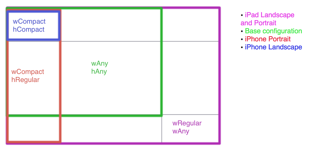 ⇨One interesting thing to note here: iPad has regular x regular for both landscape and portrait. Straight from Apple's 'What's new in iOS8 guide'
“With the amount of screen space available, the iPad has a regular size class in the vertical and horizontal directions in both portrait and landscape orientations.”
Ok, enough by-the-books stuff, lets open up Xcode 6 and try it out for ourselves.
⇨Create a new universal project for this demo. If you want to try it out in an existing Xcode 6 project, then you might have to explicitly enable size classes. You can do this in Interface Builder in the file inspector, right below the enable autolayout checkmark.
⇨First, let's look at the size class grid in Xcode. This is the area where you can switch your storyboard between the different layout combinations. While viewing your storyboard, look towards the bottom and Click on the label that says "wAny hAny".
You will see something that looks like the grid from the top of this post.
⇨By default, we start in our base configuration of any width and any height. Think of this as your master interface, things setup and changed here will be used by both the iPhone and iPad layout by default for all orientations. Apple recommends doing most of the interface work in this configuration, simply because it would mean less work for you.
⇨There are specifically 4 things you can change between size classes in interface builder:
1) Constraint constants 2) Fonts
3) Turning constraints on/off 4)Turning subviews on/off.
⇨The first two are pretty self explanatory, but let me show you how the last 2 work.⇨Every view controller in your app gets a trait collection object.
This trait collection object has 2 size classes: a horizontal size class and a vertical size class.
And each of these classes has 3 possible values:
compact, regular, or any.
⇨These values can change based on the device and its orientation. Your app will layout its interface for each view controller based on the current size classes. Apple uses a grid to let the user choose which configuration to work in, so here's that same grid but with each device+orientation highlighted in its corresponding size class combo:
“With the amount of screen space available, the iPad has a regular size class in the vertical and horizontal directions in both portrait and landscape orientations.”
Ok, enough by-the-books stuff, lets open up Xcode 6 and try it out for ourselves.
⇨Create a new universal project for this demo. If you want to try it out in an existing Xcode 6 project, then you might have to explicitly enable size classes. You can do this in Interface Builder in the file inspector, right below the enable autolayout checkmark.
⇨First, let's look at the size class grid in Xcode. This is the area where you can switch your storyboard between the different layout combinations. While viewing your storyboard, look towards the bottom and Click on the label that says "wAny hAny".
You will see something that looks like the grid from the top of this post.
⇨By default, we start in our base configuration of any width and any height. Think of this as your master interface, things setup and changed here will be used by both the iPhone and iPad layout by default for all orientations. Apple recommends doing most of the interface work in this configuration, simply because it would mean less work for you.
⇨There are specifically 4 things you can change between size classes in interface builder:
1) Constraint constants 2) Fonts
3) Turning constraints on/off 4)Turning subviews on/off.
You can find how Turning constraints on/off from our previous post.
Now let's try forTurning subviews on/off.
⇨Make new single view application and name as SkipLayout and make sure the application is universal.
We are gone use Main.storyboard and will use 6 different views as shown below.

⇨Both top views has width:260 and height:160.And right view has X:20 and Y:20px and left view has X:310px Y:20 px.
⇨The 3 midle view has same width and height which is w:176 px and height : 160 px .The middle first view start at X:20 px and all 3 views have space between them which is 16 px. All 3 view's Y is 220 px.
⇨And the last bottom view has width:560 px and height:160 px. And it's position is X:20 px and Y:42 px.
If you run the application you will see that nothing looks good. I have run application in iphone 5. And if you run app in any simulator you will notice that nothing looks good.

You can find wAny hAny written at bottom of your story board as shown in below image.

You can see its description in detail from my previous blog post.
And each of these classes has 3 possible values:
compact, regular, or any.
⇨So now make sure you start with size class wAnyhAny. Because if you choose any other size class options then everything you do will apply to those devices with those size classe.
⇨So if you start with everything in compact width and compact height and then if you switch to ipad size then nothing will appear as you have design only for compact width and compact height. Not for other size classes.
⇨So now what we gone do is we apply constrains so when the device is resized or you gone say device has defferent sizes then these constrains will apply and know how these views will position.
⇨So first we all know that this all 6 views have same height . So we will select all views and go to Editor>Pin>Heights Equally. So no metter what the size changes all these has same height.


⇨So if you run again everything looks bad as contrains aren’t has enough information.We need to turn this constrains into blue so we have to provide enough information.
⇨We know that these top 2 has same width so we go to Editor>Pin>Width Equallly.
⇨We will do same for middle 3 views as they 3 are also same width.


⇨So now still we don’t have enough constrains as we didn’t provide information about leading or trailing space.
⇨So now we need to apply leading space to view and to apply that we have another option to apply constrains is that we control drag that view to the view with respect to whom we want to apply constrain.⇨In our case control drag the top left view to main view and you will see there constrains in which select Leading space to container.
 So we will do same for middle first view and also for bottom view.
Now we will do for top right view and fix its trailing space to container.

⇨We will do same trailing space to container for middle last view and bottom view.For middle view we are not gone a do leading or trailing space to container but we are gone position it to in relation to its siblings.
⇨So we are gone do is we are gone apply horizontal gap here.We are gone control drag top left view to top right view and select horizontal space between them as shown in image.
⇨So we are gone do is we are gone apply horizontal gap here.We are gone control drag top left view to top right view and select horizontal space between them as shown in image.

Now we will do same for middle first view to middle view and also from middle view to middle last view.


⇨Do same for middle views but if you drag middle first view to top left view you will see vertical spacing option there and select that.
⇨For middle second view you can drag it to top left or top right any view.See below images.


Turning subviews on/off
To do this first let's click on wAnyhAny you will see one popup like below.

⇨So this image is actually indicating that if we select grid which is wCompact hRegular our storyboard will now for iphone in portrait mode.
⇨That means whatever now we develop in this selected mode will only displayed in iphone portrait mode and if you run same app in ipad or run as iphone in landscape mode it will not displayed.
⇨This is classes as Turning subviews on/off. Let's try this using below steps:
⇨Select wRegular hRegular from size classes which is actually we have selected ipad in both landscape and portrait mode shown as below.
Because ipad has same size in landscape and portrait both mode.
 Select wRegular hRegular from size Now take 1 label and name as Right and put that in bottom view at right size and take another label named as left and put it to left in bottom view.
 Give constrains to Right label as trailing space and top space respective to bottom view and set it to size to fit content size from editor.
Now give constrains to Left label as Leading space and top space respective to bottom view and set it to size to fit content size from editor.
⇨That means whatever now we develop in this selected mode will only displayed in iphone portrait mode and if you run same app in ipad or run as iphone in landscape mode it will not displayed.
⇨This is classes as Turning subviews on/off. Let's try this using below steps:
⇨Select wRegular hRegular from size classes which is actually we have selected ipad in both landscape and portrait mode shown as below.
Because ipad has same size in landscape and portrait both mode.

⇨Now if you run application in iphone you will see that in iphone in portrait and landscape both mode will see nothing but just 6 views. Left and right labels are not shown.
⇨Now if run app using ipad simulators you will see those labels in landscap and portrait both mode.
⇨Now you get to know how Turning subviews on/off works and also how size class works.
⇨Now if run app using ipad simulators you will see those labels in landscap and portrait both mode.
⇨Now you get to know how Turning subviews on/off works and also how size class works.
.png)

Hopefully this has helped you get a basic understanding of size classes and how they can greatly simplify your work in interface builder.
For more practice of auto layout you can check post Practicing Auto Layout with an example


.png)