Showing posts with label ios 8. Show all posts

Wednesday, 28 January 2015

How to create build for simulator and also run that build in simulator?

Generate a Simulator Build

In order to generate a simulator build you will:
i)Find the folder containing your xcode project.
ii)Open a terminal and run a couple of commands to generate the build.
1)Find your Xcode project directory The easiest way to find your Xcode project is to use Xcode itself. Control-click on your project and select Show in Finder:
2)Open a Terminal and Find Your Simulator SDK Version Click on the tasks menu in finder, Open With and Terminal. This will open the finder and automatically select the .xcodeproj directory.
This will open a terminal with the right directory already opened:
Change the working directory for the shell inside of the terminal so that it's set to the parent directory:
Figure out which SDKs versions are available by running the following command in the terminal:
xcodebuild -showsdks

What you want from this output is the string for the iOS Simulator SDK.
Choose the most recent version if you have more than one installed:
Build the Simulator Package:In your terminal you will want to run this command with the proper simulator SDK string replaced with the string you found in the previous step:
xcodebuild -arch i386 -sdk iphonesimulator{version}
If you are using workspace instead of xcodeproj then don't use above command instead use:
xcodebuild -arch i386 -sdk iphonesimulator{version} -workspace[projectName].xcworkspace - scheme [projectName]
Or you can use:
xcodebuild -workspace {project name}.xcworkspace -scheme {project name} -arch i386 -sdk iphonesimulator8.1

This should generate a build. If the build was successful you should see a lot of output from the build tools followed by the string ** BUILD SUCCEEDED ** in your terminal.

Your build path is
{base directory}/build/Release-iphonesimulator/{projectname}.app

If you build the workspace.
{Derive data directory}/build/Release-iphonesimulator/{projectname}.app
Yes, it is your final Simulator Build.

How to run it on Simulator?

your simulator build by running command:
ios-sim launch
Also verify that the app opens in the simulator.

How to install ios-sim?

If you get error with error message:
-bash: ios-sim: command not found.

Follow the step to install the ios-sim
Download node.js from http://nodejs.org/download/ for your system.
Open node package file.
Install it on your system.
Open the terminal and run the command: $ sudo npm install ios-sim -g
Now ios-sim is install on your system.

Sunday, 18 January 2015

Practicing Auto Layout - An example of keyboard sensitive layout

The keyboard sensitive layout is very common in iOS apps, in which the view(s) will automatically shrink or extend when the keyboard comes out or disappears.
OK, ready? Let’s go!
1. Creating the view hierarchy
Start a new project with single view application. Drag a UITextView and a UIButton into the controller’s default view. Make these two views extend to fill the parent view. Keep the button’s height as the system default (44 points)

2. Setup the constraints
Now expand the “Constrants” node in Interface Builder. We can find that the Interface Builder has already generated some constraints for us. The purple icon indicates that it’s managed by IB, and the blue ones are user-managed constraints. A user-managed constraint can be deleted manually. And each time you create or delete a constraint, Interface Builder may recalculate those constraints to determine if there’s need to generate non-user-managed constraint. So you have to take care of the change of the automatic generated constraint.


In this example, we will define 3 user-managed constraints in vertical space:
  • The top spacing between the text view and the parent view.
  • The spacing between the text view and the button.
  • The bottom spacing between the button and the parent view.
Set constant value of those constraints to “0″ to make the subviews fill the parent bounds.

3. Creating the outlet of the constraint to make it changeable by code
When the keyboard comes out, we need to change some spacing to make the new layout adaptive to the keyboard. But with Auto Layout, we have to remember these 2 things:
  • All the frames of views are calculated by the Auto Layout system. We should not arbitrarily change the frame of some view as what we have done before.
  • The constraints of the view of the root controller are managed by the system, we should not take the charge of it.
According to the concerns above, among the user-managed constraints we have created, the bottom spacing constraint is best suitable for this task. So, we create an referencing outlet named “keyboardHeight” to the constraint.


4. Coding for keyboard notification
OK, now let’s code for the keyboard events.
#import "PALViewController.h"
@interface PALViewController ()
@property(weak, nonatomic)IBOutlet UITextView *textView;
//The outlet of the bottom spacing constraint
@property(weak,nonatomic) IBOutlet NSLayoutConstraint *keyboardHeight;
- (IBAction)dismissKeyboard:(id)sender;
@end

@implementation PALViewController
- (void)didReceiveMemoryWarning{
[didReceiveMemoryWarning]
// Dispose of any resources that can be recreated.
}
- (void)observeKeyboard {
[[NSNotificationCenter addObserver:self selector: @selector(keyboardWillShow:) name:UIKeyboardWillChangeFrameNotification object:nil];
[[NSNotificationCenter defaultCenter] addObserver:self selector: @selector(keyboardWillHide:) name:UIKeyboardWillHideNotification object: nil];
}
- (void)viewDidLoad{
[super viewDidLoad];
// Begin observing the keyboard notifications when the view is loaded.
[self observeKeyboard];
}
// The callback for frame-changing of keyboard
- (void)keyboardWillShow:(NSNotification *)notification {
NSDictionary *info = [notification userInfo];
NSValue *kbFrame = [info objectForKey:UIKeyboardFrameEndUserInfoKey];
NSTimeInterval animationDuration = [[info objectForKey:UIKeyboardAnimationDurationUserInfoKey] doubleValue];
CGRect keyboardFrame = [kbFrame CGRectValue];
CGFloat height = keyboardFrame.size.height;
NSLog(@"Updating constraints.");
// Because the "space" is actually the difference between the bottom lines of the 2 views,
// we need to set a negative constant value here.
self.keyboardHeight.constant = height;
[UIView animateWithDuration:animationDuration animations:^{
[self.view layoutIfNeeded];
}];
}
- (void)keyboardWillHide:(NSNotification *)notification {
NSDictionary *info = [notification userInfo];
NSTimeInterval animationDuration = [[info objectForKey:UIKeyboardAnimationDurationUserInfoKey] doubleValue];
self.keyboardHeight.constant = 0;
[UIView animateWithDuration:animationDuration animations:^{
self.view layoutIfNeeded];
}];
}
- (IBAction)dismissKeyboard:(id)sender {
[self.textView resignFirstResponder];
}
@end
First, we should register the observer as before. But, in the callback methods, there are slight changes to the prior code. We used to recalculate and set the frames of some view according to the keyboard’s frame. By adopting Auto Layout, we now turn to code against the constraints instead.
Line 38-46 shows how to obtain the height of keyboard and update the layout when keyboard appears or changes.
Now run the sample app, let’s see if it works.
When you tap the text view, the keyboard appears, and the text view will automatically shrink. When the keyboard dismissed, the button will slide down, and the text view will fill the rest part of the screen again.

Perfect! The Auto Layout just works as magic!
 
Conclusion
In this example, we have learned how to implement a common case in iOS application. With Auto Layout, we are now talking to the constraints instead of directly manipulating view frames.

Saturday, 4 October 2014

Size Classes with Xcode 6: One storyboard for all Sizes Part - II

My favourite feature of Xcode 6 so far is the new size classes concept in Interface Builder. Size classes are Apple's solution to the question "How can I easily work with so many different screen sizes and device orientations?" They also enable the condensing of universal apps into one storyboard file. Combined with the new adaptive view controllers, it's easier then ever to rely on interface builder, rather than fight with it, to simplify the creation of your app layouts.
⇨Every view controller in your app gets a trait collection object.
This trait collection object has 2 size classes: a horizontal size class and a vertical size class.
And each of these classes has 3 possible values:
compact, regular, or any.
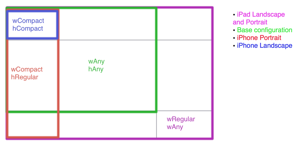
⇨These values can change based on the device and its orientation. Your app will layout its interface for each view controller based on the current size classes. Apple uses a grid to let the user choose which configuration to work in, so here's that same grid but with each device+orientation highlighted in its corresponding size class combo:
⇨One interesting thing to note here: iPad has regular x regular for both landscape and portrait. Straight from Apple's 'What's new in iOS8 guide'
“With the amount of screen space available, the iPad has a regular size class in the vertical and horizontal directions in both portrait and landscape orientations.”
Ok, enough by-the-books stuff, lets open up Xcode 6 and try it out for ourselves. 
⇨Create a new universal project for this demo. If you want to try it out in an existing Xcode 6 project, then you might have to explicitly enable size classes. You can do this in Interface Builder in the file inspector, right below the enable autolayout checkmark.
⇨First, let's look at the size class grid in Xcode. This is the area where you can switch your storyboard between the different layout combinations. While viewing your storyboard, look towards the bottom and Click on the label that says "wAny hAny".
You will see something that looks like the grid from the top of this post.
⇨By default, we start in our base configuration of any width and any height. Think of this as your master interface, things setup and changed here will be used by both the iPhone and iPad layout by default for all orientations. Apple recommends doing most of the interface work in this configuration, simply because it would mean less work for you.
⇨There are specifically 4 things you can change between size classes in interface builder:
1) Constraint constants          2) Fonts
3) Turning constraints on/off&nbsp4)Turning subviews on/off.
⇨The first two are pretty self explanatory, but let me show you how the last 2 work.
You can find how Turning constraints on/off from our previous post.
Now let's try forTurning subviews on/off.
⇨Make new single view application and name as SkipLayout and make sure the application is universal.
We are gone use Main.storyboard and will use 6 different views as shown below.
As you can see in image we have 6 views.
⇨Both top views has width:260 and height:160.And right view has X:20 and Y:20px and left view has X:310px Y:20 px.
⇨The 3 midle view has same width and height which is w:176 px and height : 160 px .The middle first view start at X:20 px and all 3 views have space between them which is 16 px. All 3 view's Y is 220 px.
⇨And the last bottom view has width:560 px and height:160 px. And it's position is X:20 px and Y:42 px.
If you run the application you will see that nothing looks good. I have run application in iphone 5. And if you run app in any simulator you will notice that nothing looks good.
You can see that everything is running out off size and the reason is that what we design is for a size class of wAny hAny .
You can find wAny hAny written at bottom of your story board as shown in below image.
If you click that you can see there are different size classes available there .
You can see its description in detail from my previous blog post.
And each of these classes has 3 possible values:
compact, regular, or any


⇨So now make sure you start with size class wAnyhAny. Because if you choose any other size class options then everything you do will apply to those devices with those size classe.
⇨So if you start with everything in compact width and compact height and then if you switch to ipad size then nothing will appear as you have design only for compact width and compact height. Not for other size classes.
⇨So now what we gone do is we apply constrains so when the device is resized or you gone say device has defferent sizes then these constrains will apply and know how these views will position.
⇨So first we all know that this all 6 views have same height . So we will select all views and go to Editor>Pin>Heights Equally. So no metter what the size changes all these has same height.

  Notice that below is look of storyboard.
⇨You can see that all constrains are showing in orange which means we haven’t provided enough information to constrains to size this items.
⇨So if you run again everything looks bad as contrains aren’t has enough information.We need to turn this constrains into blue so we have to provide enough information.
⇨We know that these top 2 has same width so we go to Editor>Pin>Width Equallly.
⇨We will do same for middle 3 views as they 3 are also same width.
⇨So now still we don’t have enough constrains as we didn’t provide information about leading or trailing space.
⇨So now we need to apply leading space to view and to apply that we have another option to apply constrains is that we control drag that view to the view with respect to whom we want to apply constrain.
⇨In our case control drag the top left view to main view and you will see there constrains in which select Leading space to container.

So we will do same for middle first view and also for bottom view.
Now we will do for top right view and fix its trailing space to container.
⇨We will do same trailing space to container for middle last view and bottom view.For middle view we are not gone a do leading or trailing space to container but we are gone position it to in relation to its siblings.
⇨So we are gone do is we are gone apply horizontal gap here.We are gone control drag top left view to top right view and select horizontal space between them as shown in image.

Now you can see that something is starting turning blue here.
Now we will do same for middle first view to middle view and also from middle view to middle last view.
Now we still don’t have info for Y- position so we need select top left view and control drag to container and select Top Space to Top Layout Guide
⇨Do same for top right view also.
⇨Do same for middle views but if you drag middle first view to top left view you will see vertical spacing option there and select that.
⇨For middle second view you can drag it to top left or top right any view.See below images.

Now for bottom view , first control drag it to middle first view and select vertical spacing then do control drag bottom view to middle second and third view and select same option.
Now we just need to give Bottom Space to Bottom Layout Guide for bottom view.
Now if you run the app you will see that it looks perfectly fine in all simulators in landscap and portrait mode.

Now Let's try option which is :
Turning subviews on/off
To do this first let's click on wAnyhAny you will see one popup like below.
The pop up is actually new size classes feature in ios 8 with Xcode6 as we know already. The value of this size classes is shown in below grid image.

⇨So this image is actually indicating that if we select grid which is wCompact hRegular our storyboard will now for iphone in portrait mode.
⇨That means whatever now we develop in this selected mode will only displayed in iphone portrait mode and if you run same app in ipad or run as iphone in landscape mode it will not displayed.
⇨This is classes as Turning subviews on/off. Let's try this using below steps:
⇨Select wRegular hRegular from size classes which is actually we have selected ipad in both landscape and portrait mode shown as below.
Because ipad has same size in landscape and portrait both mode.
Select wRegular hRegular from size Now take 1 label and name as Right and put that in bottom view at right size and take another label named as left and put it to left in bottom view.
Give constrains to Right label as trailing space and top space respective to bottom view and set it to size to fit content size from editor.
Now give constrains to Left label as Leading space and top space respective to bottom view and set it to size to fit content size from editor.


⇨Now if you run application in iphone you will see that in iphone in portrait and landscape both mode will see nothing but just 6 views. Left and right labels are not shown.
⇨Now if run app using ipad simulators you will see those labels in landscap and portrait both mode.
⇨Now you get to know how Turning subviews on/off works and also how size class works.


Now you can play with this as set one label in landscape mode of iphone and run application it will show in iphone in landscape mode only. Will not display in iphone in portrait mode or in ipad as well.
Hopefully this has helped you get a basic understanding of size classes and how they can greatly simplify your work in interface builder. For more practice of auto layout you can check post Practicing Auto Layout with an example

Sunday, 14 September 2014

Size Classes with Xcode 6: One storyboard for all Sizes Part - I

My favorite feature of Xcode 6 so far is the new size classes concept in Interface Builder.
Size classes are Apple's solution to the question "How can I easily work with so many different screen sizes and device orientations?" They also enable the condensing of universal apps into one storyboard file. Combined with the new adaptive view controllers, it's easier then ever to rely on interface builder, rather than fight with it, to simplify the creation of your app layouts.
⇨Every view controller in your app gets a trait collection object. This trait collection object has 2 size classes, a horizontal size class and a vertical size class.
⇨And each of these classes has 3 possible values:
compact, regular, or any.
These values can change based on the device and its orientation. Your app will layout its interface for each view controller based on the current size classes. Apple uses a grid to let the user choose which configuration to work in, so here's that same grid but with each device+orientation highlighted in its corresponding size class combo:
One interesting thing to note here: iPad has regular x regular for both landscape and portrait. Straight from Apple's 'What's new in iOS8 guide'
“With the amount of screen space available, the iPad has a regular size class in the vertical and horizontal directions in both portrait and landscape orientations.”
Ok, enough by-the-books stuff, lets open up Xcode 6 and try it out for ourselves.
⇨Create a new universal project for this demo. If you want to try it out in an existing Xcode 6 project, then you might have to explicitly enable size classes.
⇨You can do this in Interface Builder in the file inspector, right below the enable autolayout checkmark.
First, let's look at the size class grid in Xcode. This is the area where you can switch your storyboard between the different layout combinations. ⇨While viewing your storyboard, look towards the bottom and Click on the label that says "wAny hAny". You will see something that looks like the grid from the top of this post.
⇨By default, we start in our base configuration of any width and any height. Think of this as your master interface, things setup and changed here will be used by both the iPhone and iPad layout by default for all orientations.
⇨Apple recommends doing most of the interface work in this configuration, simply because it would mean less work for you.
⇨Let's layout a super-wide button in the center of the screen to play with. Give it a green background color so we can see its true size, center it vertically and horizontally with constraints:
⇨And give it a ridiculous fixed width of 600:
⇨Now run the app in both iPad and iPhone simulators. You will see it centered on both, but its clearly too wide for iPhone in both orientations.
⇨Let's use size classes to fix that. Go back to the grid and select the iPhone portrait config, compact width + regular height. Thats the red rectangle from the grid :
⇨You will notice that the bar you click on to access the grid changed from white to blue.
⇨This is basically just warning you: "Hey you're not in the base configuration anymore! Some changes you make here will only show when your app is running with these specific size classes.
⇨So now this bar is blue!" I say 'some' changes because there are specifically 4 things you can change between size classes in interface builder:
1) Constraint constants            2) Fonts
3) Turning constraints on/off    4)Turning subviews on/off.
⇨The first two are pretty self explanatory, but let me show you how the last 2 work.
Lets try turning a constraint off for the current size class
we are in (compact width and regular height).
⇨In the document outline, click on the Center X Alignment constraint we setup on our button:

⇨Now look in the attributes inspector, towards the bottom you will see the word installed with a checkmark next to it, and then a plus sign to the left of that.
⇨Click the plus sign and click "Compact Width | Regular Height (current)". You will now see 2 check marked items. Uncheck the one we just added (wC hR).
⇨Now our constraint is no longer installed and doing anything for this configuration of size classes.
⇨As you can see, Xcode is complaining that our constraints are too ambiguous, and if you run the app on an iPhone sim the button is no longer centered on the X axis.
⇨But running it on the iPad shows it still centered, because that constraint is still installed on our base configuration. It will be installed on every configuration except the one we just unchecked.
You can even rotate your iPhone sim and the button will magically go back to being centered, since iPhone landscape is a different size class config.
⇨Ok lets put the checkmark back in so the button goes back to being centered.
⇨Now lets change the constant we set for the buttons width. Select the button itself, and go to the Size Inspector and scroll to the bottom where all the constraints are. Click the Width Equals one and set it to 100:
⇨Run the app on the iPhone sim now, and you will see the button has the correct width for portrait iPhone. Running on the iPad sim shows the button 600 wide since we didn't change the width on our base config.
⇨However, it still doesn't look good on iPhone landscape, because iPhone landscape is still pulling from our base Any x Any configuration. Lets fix that.
⇨In the grid, select compact width and compact height. Thats the blue rectangle in our grid:
⇨Now change the width constant for this configuration the same way we did for compact x regular. Give it a width of 400.
⇨Running the app in iPhone and rotating to landscape causes the button to take a 400 width, which looks great (for our learning purposes). Whats nice is you can see a list of all the constants for each constraint for each different configuration.
⇨Just select the constraint you want to look at in the document outline, then go its its attribute inspector and they are all listed neatly below the original constant. It labels each one based on which configuration it applied on.
⇨What if we decided we wanted the button to disappear only when the iPhone was in landscape mode? Well with size classes we can uninstall views just like we uninstalled a constraint. Select our UIButton, scroll down to the very bottom of our attributes inspector, and add a new installed option for our current configuration by hitting the plus button, and then uncheck it.
⇨As you can see, the view instantly disappears from the storyboard because we uninstalled it on the configuration we are currently looking at. Running the app, you can see its gone in portrait iPhone, but it comes back when you rotate to landscape. And it will still be installed on the iPad since our iPad still uses the base configuration.
⇨The last thing I want to show is how we can be notified in code when these configurations are changed by something (usually a rotation).  Sizes classes are meant to replace the use of UIInterfaceOrientation & UIUserInterfaceIdiom, so its important to understand how to work with them in your code. 
⇨The first you will need to do is set your view controller(s) to conform to the UITraitEnviroment protocol:
class ViewController:UIViewControlle,UITraitEnvironment{
   override func viewDidLoad()
   {
     //code
   }
}
This protocol has a required method that notifies your view controller when the trait collection has changed:
override func traitCollectionDidChange(previousTraitCollection: UITraitCollection!) {
        if previousTraitCollection? {
          //print out the previousTrait's info
        println(previousTraitCollection)
        }
    }
A UITraitCollection provides details about the attributes of a view controller. Heres what printing them out shows:

Those last two describe the vertical and horizontal size class of the trait collection we just changed from. Heres how that enum looks:
UIUserInterfaceSizeClass : Int {
     case : Unspecified
     case : Compact
     case : Regular
}
So now you know how turning a constraint off for the current size classes works.
Now Let's try another option which is : Turning subviews on/off You can find it in our next post from here Turning subviews on/off.
Hopefully this has helped you get a basic understanding of size classes and how they can greatly simplify your work in interface builder.